Section 10.2 Custom Interfaces
A custom interface is defined using the
interface keyword and a list if method signatures. We saw the source code for three Java Core Library examples, the Comparable<T> interface in Subsection 10.1.1 and the Iterable<T> and Iterator<T> interfaces in Subsection 10.1.2. Let’s create a custom interface and implement it along with other interfaces.Subsection 10.2.1 Defining a Custom Interface
In this section we want to build a graphical panel demonstrating three kinds of tri-option selector widgets. The way these widgets look may be customized, but all must give the user the ability to select from the three options and provide a way to report the currently selected option. To ensure that all tri-option widgets provide common capabilities, we define a TriOption interface that all selector widgets must implement. In Listing 10.2.1 we specify that the TriOption interface includes four signatures. This public interface must be saved to a file having the same name as the interface, and compiled with the other files in the project, in a manner exactly analogous to any multi-file Java project.
// TriOption.java
// Required for selector widgets with three options
public interface TriOption {
  public void setOption1();       // Set to option 1
  public void setOption2();       // Set to option 2
  public void setOption3();       // Set to option 3
  public int  getOption();        // Get current selected option
}
TriOption.javaTo implement this interface we follow the same procedure as we did with Core Library interfaces. For example, if we were defining a class called TogglingSelector that implemented the TriOption interface, we would start the class with something like the following, and then implement in the the TogglingSelector class at least the four methods that match the four interface signatures.
public class TogglingSelector implements TriOption {
  // …
  public void setOption1() { … }
  public void setOption2() { … }
  public void setOption3() { … }
  public void getOption()  { … }
}
Subsection 10.2.2 Implementing Multiple Interfaces
We may implement multiple interfaces in the same class at the same time. The only requirement is that all mandated signatures from all interfaces must be implemented as concrete methods in the class. For our example, let’s say that we want to sort all selectors on a panel according to the selected option number: 1, 2 or 3. We can make use of what we get in the Java Core Library and implement the
Comparable<TriOption> interface using the static sort() method built in to the provided Arrays or the Collections class. To implement multiple interfaces, follow the implements keyword with a comma-separated list of interfaces, as in Listing 10.2.2.public class TogglingSelector
implements TriOption, Comparable<TriOption> {
// …
public void setOption1() { … }
public void setOption2() { … }
public void setOption3() { … }
public void getOption() { … }
@Override
public int compareTo(TriOption other) {
return (this.getOption() - other.getOption());
}
}
Subsection 10.2.3 Adding Inheritance
Selector widgets in our example will be based on DoodlePad Shape classes. To get the maximum benefit we want to extend the existing Shape classes so that we can inherit all behavior of the base Shape class. Nothing prevents us from simultaneously extending an existing class and implementing multiple interfaces.
The TogglingSelector will be round and respond to mouse presses. Each time the mouse is pressed on a TogglingSelector object, it toggles through the three options available, changing its color and text display to match. Listing 10.2.3 expands Listing 10.2.2 further so that it also inherits the Oval class. Note how the top line of the class definition both
extends Oval and implements TriOption and Comparable<TriOption>. The constructor invokes a base class constructor on its first line by invoking super(…) and we override onMousePressed(…) to add custom mouse-pressed behavior to the class, but invoke super.onMousePressed(x, y, button) to ensure any default behavior is executed.// TogglingSelector.java
import doodlepad.*;
public class TogglingSelector
extends Oval
implements TriOption, Comparable<TriOption> {
// Constructor sets up all encapsulated properties
public TogglingSelector(double x, double y) {
super(x, y, 75, 75); // Base class constructor
// …
}
// Cycle through options on each click
@Override
public void onMousePressed(double x, double y, int button) {
super.onMousePressed(x, y, button);
// …
}
// Method required by interface
public void setOption1() { … }
public void setOption2() { … }
public void setOption3() { … }
public void getOption() { … }
@Override
public int compareTo(TriOption other) {
return (this.getOption() - other.getOption());
}
}
TogglingSelection.java (version 1)The remaining class implementation is detail. The following three sections provide the three TriOption selector widgets that we implement for this example.
Subsection 10.2.4 TogglingSelector Widget
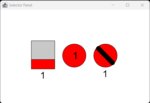
The TogglingSelector starts at option 1 and is filled with red. When clicked, it advances to option 2 and changes to a yellow fill. Then the third click changes to option 3 with a green fill. Another click cycles the widget back to option 1. The option number itself is displayed in the center of the Oval.
Listing 10.2.4 follows the outline in Listing 10.2.3 with code added to manage the visual details. Note that we are tracking the selected option using a private
option integer instance variable. An example of the TogglingSelector widget is displayed in the middle of Figure 10.2.8.// TogglingSelector.java
import doodlepad.*;
public class TogglingSelector
extends Oval
implements TriOption, Comparable<TriOption> {
private int option; // Selected option
// Constructor sets up all encapsulated properties
public TogglingSelector(double x, double y) {
super(x, y, 75, 75); // Base class constructor
this.setFontSize(32);
this.setOption1(); // Start at option 1
}
// Cycle through options on each click
@Override
public void onMousePressed(double x, double y, int button) {
super.onMousePressed(x, y, button);
if (option == 1) {
setOption2();
} else if (option == 2) {
setOption3();
} else {
setOption1();
}
}
// Current option getter
public int getOption() {
return this.option;
}
// Set to option 1 and reconfigure display
public void setOption1() {
this.option = 1;
this.setFillColor(255, 0, 0);
this.setText("1");
}
// Set to option 2 and reconfigure display
public void setOption2() {
this.option = 2;
this.setFillColor(255, 255, 0);
this.setText("2");
}
// Set to option 3 and reconfigure display
public void setOption3() {
this.option = 3;
this.setFillColor(0, 255, 0);
this.setText("3");
}
@Override
public int compareTo(TriOption other) {
return (this.getOption() - other.getOption());
}
public String toString() {
return "TogglingSelector (option=" + this.getOption() + ")";
}
}
TogglingSelector.javaSubsection 10.2.5 SlidingSelector Widget
The SlidingSelector widget is made up of two Rectangles and a Text object. One Rectangle is used for the outer widget body and a second is used for the sliding button, which moves up and down into one of three positions corresponding to the three options. The SlidingSelector starts at option 1 with its button at the bottom of the widget and filled with red. When the widget background is clicked, the button moves up or down, depending upon the location of the mouse click. The button fill color changes with the option selected: red, yellow, green. The option number is displayed below the widget.
Listing 10.2.5 follows the same outline in Listing 10.2.3 with code added to manage the visual details. An example of the SlidingSelector widget is on the left of Figure 10.2.8.
// SlidingSelector.java
import doodlepad.*;

public class SlidingSelector
                      extends Rectangle
                      implements TriOption, Comparable<TriOption> {
  private int  option;              // Selected option
  private Rectangle button;         // button
  private Text display;             // Text display

  // Constructor sets up all encapsulated properties
  public SlidingSelector(double x, double y) {
    super(x, y, 75, 90);            // Base class constructor
    this.setFillColor(200);
    this.button = new Rectangle(x, y+60, 75, 30);
    this.button.setEventsEnabled(false);
    this.display = new Text("", x+28, y+100, 30, 30);
    this.setOption1();              // Start at option 1
  }
  // Choose option based on mouse y-position
  @Override
  public void onMousePressed(double x, double y, int button) {
    super.onMousePressed(x, y, button);
    if (y >= this.getY() + 60) {
      this.setOption1();
    } else if (y >= this.getY() + 30) {
      this.setOption2();
    } else {
      this.setOption3();
    }
  }
  // Current option getter
  public int getOption() {
    return this.option;
  }
  // Set to option 1 and reconfigure display
  public void setOption1() {
    this.option = 1;
    this.button.setY(this.getY() + 60);
    this.button.setFillColor(255, 0, 0);
    this.display.setText("1");
  }
  // Set to option 2 and reconfigure display
  public void setOption2() {
    this.option = 2;
    this.button.setY(this.getY() + 30);
    this.button.setFillColor(255, 255, 0);
    this.display.setText("2");
  }
  // Set to option 3 and reconfigure display
  public void setOption3() {
    this.option = 3;
    this.button.setY(this.getY());
    this.button.setFillColor(0, 255, 0);
    this.display.setText("3");
  }
  @Override
  public int compareTo(TriOption other) {
    return (this.getOption() - other.getOption());
  }
  public String toString() {
    return "SlidingSelector  (option=" + this.getOption() + ")";
  }
}
SlidingSelector.javaSubsection 10.2.6 RotatingSelector Widget
The RotatingSelector widget is made up an Oval, a thick line, and a Text object. The line is rotated left for option 1, right for option 3, and in between in a vertical position for option 2. The RotatingSelector starts at option 1 with its line rotated left. When the widget background is clicked, the line rotates left or right, depending upon the location of the mouse click. The button fill color changes with the option selected: red, yellow, green. The option number is displayed below the widget.
Once again, Listing 10.2.6 follows the same outline in Listing 10.2.3 with code added to manage the visual details. An example of the RotatingSelector widget is on the right of Figure 10.2.8.
// RotatingSelector.java
import doodlepad.*;

public class RotatingSelector
                      extends Oval
                      implements TriOption, Comparable<TriOption> {
  private int  option;              // Selected option
  private Text display;             // Text display
  private Line handle;              // Rotating handle

  // Constructor sets up all encapsulated properties
  public RotatingSelector(double x, double y) {
    super(x, y, 75, 75);            // Base class constructor
    this.handle = new Line(x+15, y+15, x+90, y+90);
    this.handle.setEventsEnabled(false);
    this.handle.setStrokeWidth(15);
    this.display = new Text("", x+28, y+85, 30, 30);
    this.setOption1();              // Start at option 1
  }
  // Choose option based on mouse x-position
  @Override
  public void onMousePressed(double x, double y, int button) {
    super.onMousePressed(x, y, button);
    if (x > this.getX()+50) {
      setOption3();
    } else if (x > this.getX()+25) {
      setOption2();
    } else {
      setOption1();
    }
  }
  // Current option getter
  public int getOption() {
    return this.option;
  }
  // Set to option 1 and reconfigure display
  public void setOption1() {
    this.option = 1;
    this.setFillColor(255, 0, 0);
    this.handle.setPoints(x+15, y+15, x+60, y+60);
    this.display.setText("1");
  }
  // Set to option 2 and reconfigure display
  public void setOption2() {
    this.option = 2;
    this.setFillColor(255, 255, 0);
    this.handle.setPoints(x+37, y+6, x+37, y+69);
    this.display.setText("2");
  }
  // Set to option 3 and reconfigure display
  public void setOption3() {
    this.option = 3;
    this.setFillColor(0, 255, 0);
    this.handle.setPoints(x+60, y+15, x+15, y+60);
    this.display.setText("3");
  }
  @Override
  public int compareTo(TriOption other) {
    return (this.getOption() - other.getOption());
  }
  public String toString() {
    return "RotatingSelector (option=" + this.getOption() + ")";
  }
}
RotatingSelector.javaSubsection 10.2.7 Panel Driver Class
To test our selector widget operation and sorting, we defined a Panel class, which is given in Listing 10.2.7. The Panel class derives from the Pad class, and invokes the Pad constructor from within the Panel constructor with parameters to initialize the size and window title. Panel encapsulates a TriOption array of size 3 to hold references to each kind of selector widget. The array is declared and initialized in the Panel constructor. Note that because each selector widget implements the TriOption interface, so each can be assigned to TriOption array.
// Panel.java
import java.util.Arrays;
import doodlepad.*;

public class Panel extends Pad {
  private TriOption[] selectors;

  public Panel() {
    super("Selector Panel", 480, 300);    // Base class constructor
    selectors = new TriOption[3];         // Create and fill array
    selectors[0] = new SlidingSelector( 100, 100);
    selectors[1] = new TogglingSelector(200, 110);
    selectors[2] = new RotatingSelector(300, 110);
  }
  // Handle mouse-pressed on Pad
  public void onMousePressed(double x, double y, int button) {
    // Sort based on selected state
    Arrays.sort(selectors);

    // Print order
    for (TriOption sel: selectors) {
      System.out.println(sel);
    }
  }
  // Start here
  public static void main(String[] args) {
    new Panel();
  }
}
RotatingSelector.javaThe Panel class overrides the Pad’s
onMousePressed(…) method to handle mouse clicks on the window background. When the user clicks the Panel window, the TriOption array is sorted and the array order is printed to visualize the current order.Our project now includes five files: TriOption.java, TogglingSelector.java, SlidingSelector.java, RotatingSelector.java, and Panel.java. To simplify the compilation command, all files are placed in a single directory with no other Java files so the wildcard character
* can be used: javac -cp doodlepad.jar *.java. Because Panel has our main(…) method, we launch the program with that class: java -cp .;doodlepad.jar Panel. Figure 10.2.8 shows the Panel program when it first starts.javac -cp doodlepad.jar *.java java -cp .;doodlepad.jar Panel

Panel.javaIf we click the Panel background, we see the following printed output. All selector options start at 1, so the sort operation shows no changes.
SlidingSelector  (option=1)
TogglingSelector (option=1)
RotatingSelector (option=1)
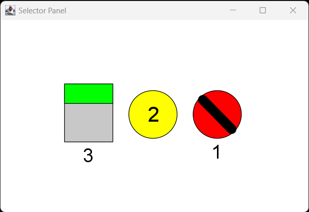
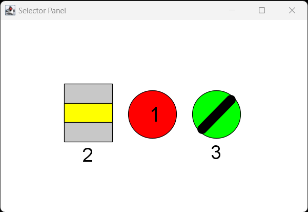
Next, we modify the options selected on each widget to look like Figure 10.2.9, with option 1 selected on the RotatingSelector, option 2 on the TogglingSelector, and option 3 on the SlidingSelector. After clicking the Panel background, we see the output printed in the session that follows Figure 10.2.9. Changing the options again (Figure 10.2.10) and clicking the Panel, the order changes again, matching the options selected. These examples confirm that sorting the TriOption array by the options selected reorders the items in the array by increasing option number.

Panel.java with options selectedRotatingSelector (option=1) TogglingSelector (option=2) SlidingSelector (option=3)

Panel.java with options changedTogglingSelector (option=1) SlidingSelector (option=2) RotatingSelector (option=3)
The example presented in this section combines many different features of the Java programming language. Each of the classes defined encapsulate, initialize, and coordinate the many parts of several objects to produce self-managed cohesive widgets, each with a custom design and behavior. Inheritance was used to start our new classes with a large amount of baseline functionality, with only object-specific customizations and specializations added. An interface was defined and implemented as a way to require that certain concrete methods are defined in all implementing classes and to enable sorting of an array using prewritten algorithms provided by the Java Core Library. Overall, the many aspects of object oriented programming each have their distinct benefits and they fit together well to produce sophisticated results.
